Creating a home for all
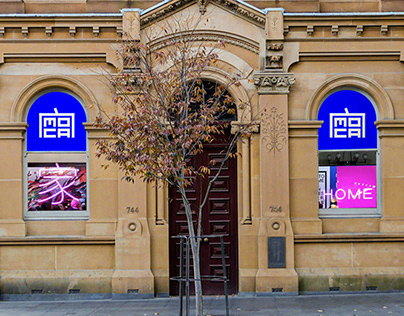
MOCA is a home for Chinese Australian stories. So, we developed a new visual identity built around the idea of home. The roof radical ?, a Kangxi character ?used in the Chinese word for ‘home’, symbolises the protection and security a roof provides. It’s the basis of our logo and identity system, acting as a dynamic frame ?that constantly adapts to house content. Using blue signals a shift from the traditionally red palette associated with China to acknowledge this as a multi-dimensional Chinese Australian story.
More than a brand refresh
This is a project that uses the power of design to help reframe ?a narrative and show its pivotal role in Australia’s cultural fabric. Our hope is that MOCA becomes a place to influence and reimagine our stories, and shape what comes next.